Building a Form
Let's walk through building an example form using Form Builder and Tx Builder. Code and concepts used in this example are from DAOhaus's MCON 2022 technical demo with Tabula.
Form Configuration and Adding Fields
We typically recommend that you keep your form's config in a dedicated file such as forms.ts in your app. Each form can then be exported from this file and imported into the page or component that'll leverage it.
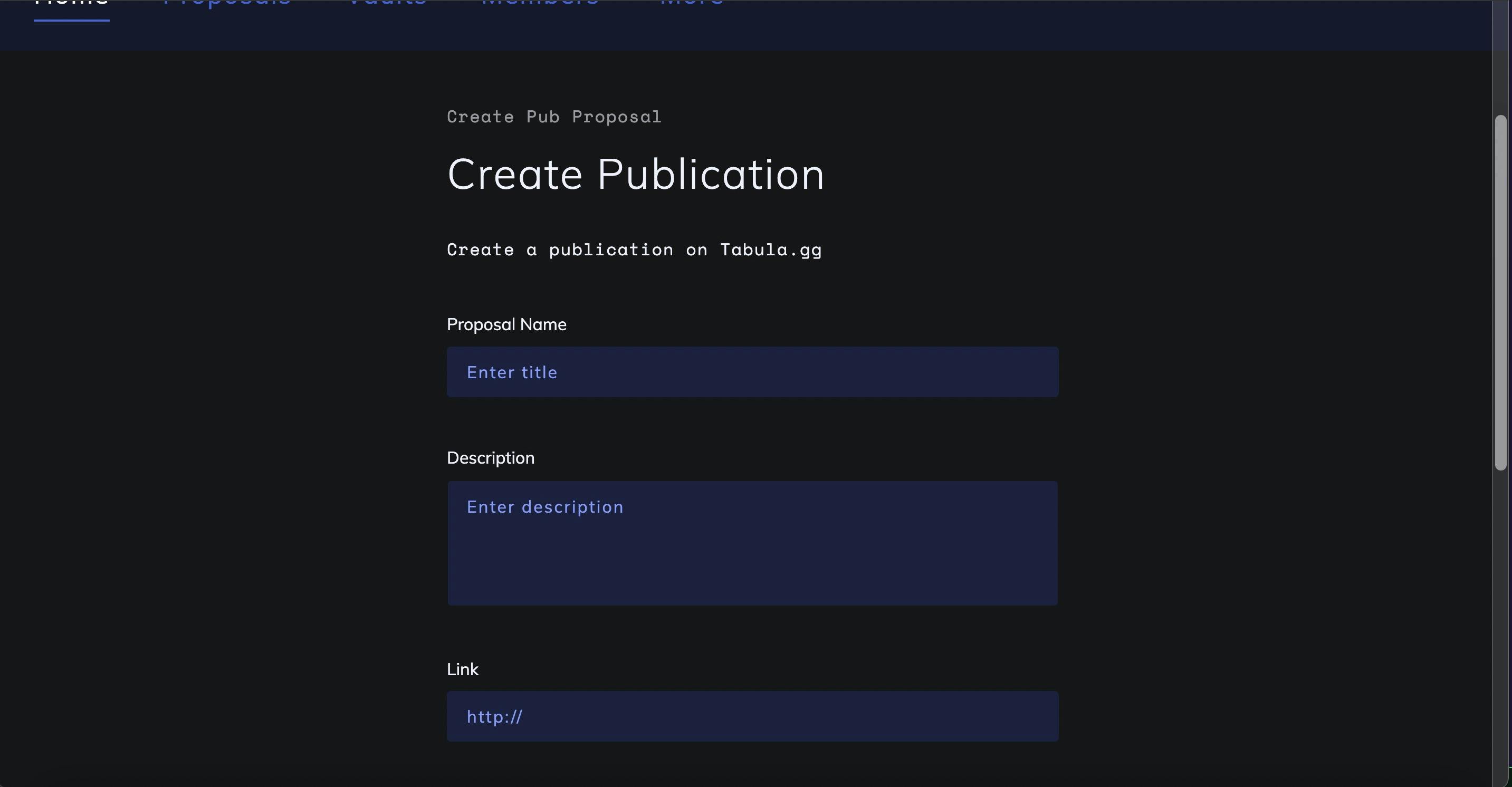
Form Builder has the following required items: id, title, description, and fields. Let's take a look.
export const TABULA_FORMS: Record<string, CustomFormLego> = {
  CREATE_PUB: {
    id: 'CREATE_PUB',
    title: 'Create Publication',
    subtitle: 'Create Pub Proposal',
    description: 'Create a publication on Tabula.gg',
    fields: [
      FIELD.TITLE,
      FIELD.DESCRIPTION,
      FIELD.LINK,
      { id: 'pubTitle', type: 'input', placeholder: 'pubtitle', label: 'Publication Title'}
    ]
  }
}
The fields property takes in an array of field objects. These can come from the prebuilt field blocks such as title, description, and link, or you can add your own field building blocks.
Custom fields can contain the following values:
id: Required. Theidthat the field block will use when rendered in the UI. In the above example, the input field for the publication title will have anidof "pubTitle."type: Required. Thetypeis the form element. In the above exampale, aninputwill be rendered with associatedid.placeholder: Theplaceholderis the input's placeholder value.label: Thelabelis the label that'll be used in the form with the corresponding element identified in thetypefield.
If we visit the test page where we're rendering our new form, we can see that it is already taking form!
This pattern can be leveraged to use the "batteries included" pre-built fields as well as your own. Depending on your app's architecture you can have a custom fields directory or you can pass in a field object like in the above example.
You can pass in as many custom fields as you'd need to meet your form's design and functionality. To continue building out the Tabula publication example, you'd likely want to repeat this process to pass in additional custom field blocks such as for the publication description. Here's an example of what that field block could look like:
  {
    id: `pubDescription`,
    type: `textarea`,
    placeholder: `pub description`,
    label: `Publication Description`
  }
Each field block needs a unique id -- same as if you'd be creating the form element from scratch. In the above field block, the type is a textarea, so this would add a text area input with the id of pubDescription.
Utility Fields Input Example: csInput
We also support more specific, powerful input types such as our comma separated input (csInput). This input type is informed by use cases that we've encountered building DAO native apps. Since this input type is specialized, it includes a bit more configuration than the other field types. Here is an example of the field object for the csInput:
{
  id: `tags`,
  type: `csInput`,
  itemNoun: {
    singular: 'tag',
    plural: 'tags'
  },
}
As this is a comma-separated input for tags, you need to pass in the itemNoun values for singular and plural. In this example, we're working with tags so the singular and plural values passed into the itemNoun object reflect that.
Form Layout Blocks
When building complex forms you often need more than the inputs on their own. Form Builder includes form layout blocks that can be leveraged as well. These are included in the fields array the same way that the other field blocks are added. This can wrap the fields that are included in its own fields array.
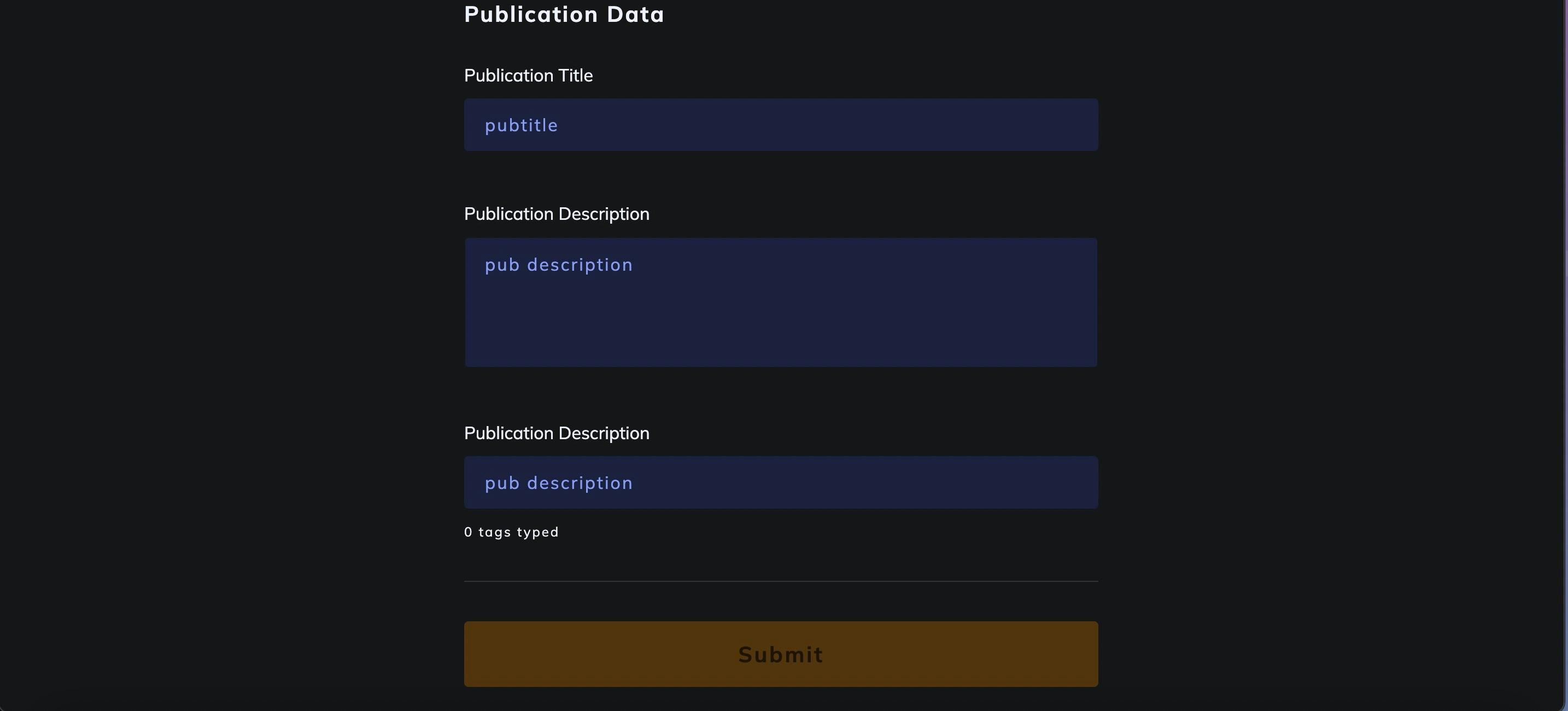
Let's add a segment to the form utilizing the formSegment field block:
  {
    id: `pubSegment`,
    type: `formSegment`,
    title: 'Publication Data',
    fields: [], // your fields here
  }
The formSegment type will render with the fields that are included. Since this introduces a new pattern to the config, let's take a look at the entire fields array on the form config:
export const TABULA_FORMS: Record<string, CustomFormLego> = {
  CREATE_PUB: {
    id: 'CREATE_PUB',
    title: 'Create Publication',
    subtitle: 'Create Pub Proposal',
    description: 'Create a publication on Tabula.gg',
    tx: TABULA_TX.CREATE_PUB,
    fields: [
      FIELD.TITLE,
      FIELD.DESCRIPTION,
      FIELD.LINK,
      {
        id: 'pubSegment',
        type: 'formSegment',
        title: 'Publication Data',
        fields: [
          {
            id: 'pubTitle',
            type: 'input',
            placeholder: 'pubtitle',
            label: 'Publication Title',
          },
          {
            id: 'pubDescription',
            type: 'textarea',
            placeholder: 'pub description',
            label: 'Publication Description',
          },
          {
            id: 'pubTags',
            type: 'csInput',
            itemNoun: {
              singular: 'tag',
              plural: 'tags',
            },
            placeholder: 'pub description',
            label: 'Publication Description',
          },
        ],
      },
    ],
  },
};
Moving our custom field blocks into the formSegment's fields array nests those fields in the segment. The title, description, and link stay outside of the form segment since they're not included in the form segment's fields array.
If we preview our form again, we'll see that all of our custom fields that we included in the form segment are in another section:
If you're building complex forms you can leverage this composable pattern to great effect.
Field Patterns
Form Builder's support for custom fields in the fields array allows for completely customized forms that leverage all of the scaffolding and best practices coming from our learnings of developing form-heavy apps over the years. If you find yourself continually adding the same custom field blocks, that may be a good opportunity to add these to a custom fields folder where they can be shared across many forms.
The order that the fields are added to the Form Builder's configuration determine the order that they're rendered in the UI (top to bottom). Leveraging the form segment component in your form configuration can improve the UX for complex forms with lots of fields.
Development Tips
When developing, we recommend adding the form that you're buiding into a page or component where it'll render. Doing this allows you to check and test the form as it's being constructed from the config. Here's an example:
// MyForm.tsx

// your imports -- FormBuilder, any custom fields, and other components

export function MyForm() {
  return (
  <FormBuilder
    form={TABULA_FORMS.CREATE_PUB}
    customFields={CustomFields}
    />
  )
}
Be sure to pass the exact form name into the <FormBuilder/> component -- in this example, we're passing in TABULA_FORMS.CREATE_PUB that we created in our form config. If you head to the page where <FormBuilder/> is imported, you'll already be able to see the form being rendered with the title, subtitle, and description from the config. Form Builder handles all of the lifecycles and validation for the form.
Following these instructions will add the form itself to your app. Check soon for a tutorial that'll demonstrate how to integrate with our Tx Builder library to extend Form Builder's power.